Case Study · Everon ADT Commercial

Modernizing the Account Dashboard for a Commercial Security SaaS Platform

An account dashboard for ADT Security System that helped commercial security administrators scan critical account data, prioritize billing tasks, and complete routine actions faster.

Everon dashboard hero

Product Designer

2 months, concept to Beta · Aug 2023

1 PM · 5 Engineers · 1 UI Designer

New dashboard feature for Everon's web SaaS platform

Problem

Commercial security administrators had to manage billing, contacts, teams, locations, security events, and account settings across a complex legacy platform. Without a centralized dashboard, critical information was hard to prioritize and routine actions were difficult to find.

My Role

Led the design of the account dashboard from information architecture to navigation explorations and quick-action patterns, partnering with PM, engineering, and visual design to ship the Beta experience.

Impact

Launched a Beta dashboard for a security SaaS platform used by 300K+ operators and reduced common task completion time by about 30% through clearer hierarchy, faster access to account data, and dashboard-level actions.

Everon, the rebranded platform from ADT Commercial, needed to modernize customer engagement, reduce support tickets, and help administrators complete routine account tasks more efficiently.

The new dashboard was designed as an add-on feature for the existing platform. The challenge was not simply creating a new landing page. It was deciding how to bring billing, contacts, team management, locations, security events, alarm settings, and account actions into one workspace without making the experience feel dense or hard to use.

Approach 01

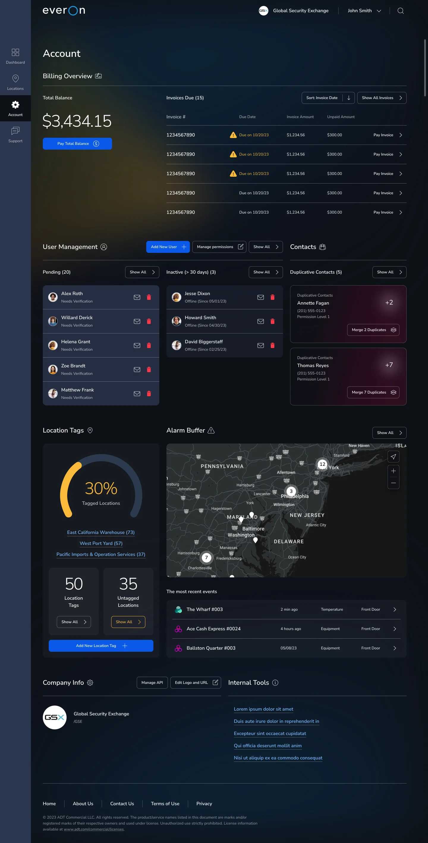
Prioritize the Right Information

Problem

Problem:
The dashboard needed to bring together billing, contacts, team management, locations, security events, and alarm settings, but not all information had the same urgency. Without a clear hierarchy, users would have to scan too much before knowing what needed attention first.

Solution

Solution:
I prioritized the most urgent and business-critical information at the top, then grouped related account areas into clear sections.

Billing was placed first because it was both a high-frequency user need and a key business priority. The overview makes the total balance immediately visible, anchors it with a primary Pay CTA, and lists the five most urgent invoices by due date with secondary payment actions.

Related account areas were grouped into distinct blocks, each with key details and related CTAs, so users could quickly understand each section and act without scanning the whole page.

Everon account dashboard — billing overview, user management, contacts, locations, and alarm buffer
Approach 02

Action Patterns by Task Complexity

Problem

Administrators needed to complete routine tasks such as paying invoices, editing contacts, removing team members, and managing locations. These actions existed across the platform, but they were not always close to the information users were acting on.

Solution

I placed essential CTAs next to the relevant account information. Instead of making users search for actions elsewhere in the platform, the dashboard gives them direct ways to act from the relevant section.

I mapped dashboard actions to different flow patterns based on task complexity.

  • Overlay action: Complete lightweight tasks directly on the dashboard.
  • Section landing page: Route general tasks to the relevant section page.
  • One-step confirmation: Complete simple sensitive actions with a CTA and confirmation alert.
  • Existing task flow: Send complex tasks directly into the existing flow with clearer entry points.
Approach 03

Clarify Account Navigation

Problem

The Account section had to support many related destinations, including users, permissions, location tags, contacts, billing, etc. These sections appeared at the same level, while billing was represented through a specific Pay Invoices label instead of a broader billing structure.

As more account sections were planned, the navigation needed to become easier to scan without taking too much space from the dashboard or adding extra steps to common tasks.

Current Account navigation

Solution

I explored three navigation models: icon-based navigation, reordering and rewording the top navigation, and a secondary side menu.

For Beta, we selected reordering and rewording because it improved label clarity, preserved the existing platform structure, and kept development effort lower.

We moved forward with reordering and rewording for Beta because it balanced user clarity, platform consistency, and delivery risk. It improved the current navigation without requiring a new interaction model, which reduced engineering dependencies and helped the team protect the Beta timeline. Larger structural changes, like icon navigation or a secondary side menu, were kept as future directions that could be revisited after usage data and feedback.

Option 02 — Reordering + rewording

The redesigned account dashboard launched in Beta in August 2023, giving Everon administrators a clearer way to scan account information and act on routine tasks from one place.

The redesign shifted the experience from a fragmented account platform into a task-oriented workspace, helping administrators see what needed attention and move faster.

300K+ operators supported by the platform

About 30% reduction in common task completion time

Critical account data became easier to scan

Common tasks became easier to find and complete

Established reusable dashboard patterns for future account management experiences

Back to Work